 What's new?

TOP 6 Diagrams in Builder: Description and Recommendations for their Use
Data visualization is a powerful business intelligence tool. It can be used to visualize any chain data that reflects the current state of affairs, patterns, and gaps, and is also an appropriate basis for making informed management decisions.
Creating visualizations is an art that requires choosing the right tools, colors, and design. Today, there are many graphical ways to represent numerical data:
- ✅ diagram
- ✅ charts
- ✅ schemes
- ✅ tables
- ✅ cards and cartograms
- ✅ interactive storytelling, etc.
All of them have their advantages, the necessary conditions for use, and the information content of the created visualization will depend on the correct choice of type diagram.
Builder - a highly efficient visualization builder
Most of the existing graphical data display tools are presented on the BES analytical platform in the diagram creator- Builder. Here you can create your design for dashboards (customize colors, shapes, signs), choose the required type of visualization from 17 available, and set up all the necessary elements (axes, legend, scale, etc.).

Creating visualizations is the responsibility of the user, which is a challenge and requires answering the following questions:
❓ How to choose the most optimal type of visualization?
❓ Does the selected visualization fully describe the chain data?
❓ Is it worth it to combine different various charts or is it just enough to use a bar chart?
To answer these and other questions, let's try to understand the most popular types of visualizations and the conditions of the best use.
Note!Discovery has shown that 85% of retailer charts are:
- histograms;
- line charts;
- tables.
It's easy to explain. These visualizations clearly show trends and patterns that are understandable to most employees and do not require additional interpretation, with their help it is simple to compare indicators and track relationships between them.
But other alternative ways can better showcase your data. To deal with them, let's look at the TOP 6 graphic visualizations and situations when it is better to use them.
Tables
Tables are the most common way to display data. They are simple, understandable, and effective for all stakeholders. Their main disadvantage is that the data is presented in raw form, so it is difficult to identify certain patterns or anomalies.
When should they be used?
- It is important to have accurate numbers and specific data. For example,what sales value was gotten in the current month, what its growth rate in % was, etc?
- You need to sort the indicators in ascending/descending order.
- You need to combine different indicators with significant differences in their values or compare indicators with numeric and non-numeric expressions.
Recommendations for use:
- Use data expansion from the highest level to the lowest. For example, from stores, and categories to subcategories and SKUs. This can help you see the most pertinent information first before learning the details.
- Build tables with multilevel columns. This will group the information in the most convenient format and make it more readable. For example, to present indicators of Profit, Sales Value, and Receipts Qty for products by stores.
- You can additionally format the data: output data with certain restrictions (more than/less than the certain values, use the required precision (number of decimal places).
- If the table contains a lot of data and dimensions, you can make available a search function that will help you quickly find the necessary information.
Histogram / Column charts
Histograms / Column charts are visualizations that are best used to display information in terms of elements that are different from each other. For example, if a chain sells different products (categories, brands), then it is best to present its sales figures in the form of column charts.
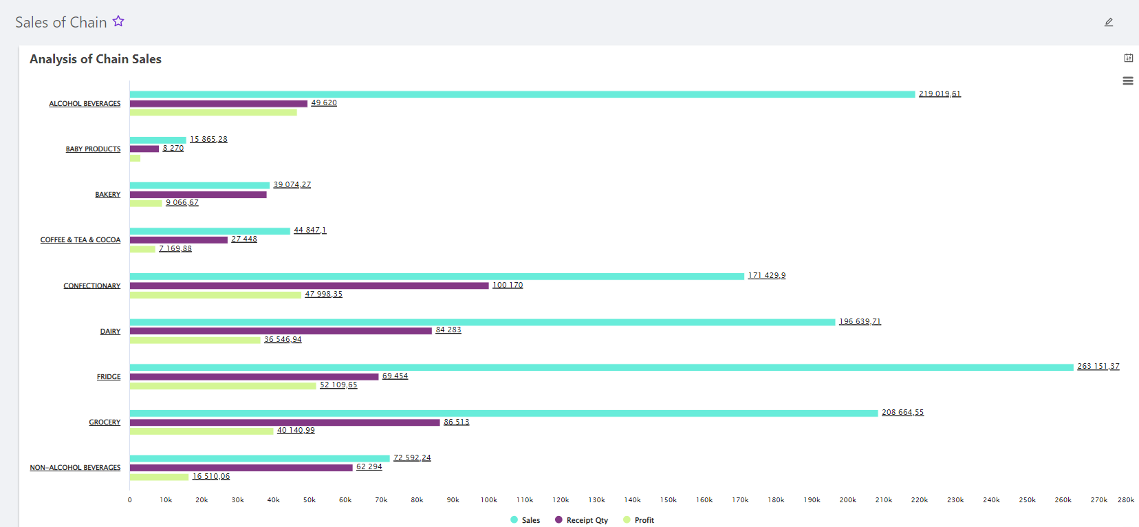
When should it be used?
- You need to compare data for different periods. For example, the analysis of sales dynamics.
- It is necessary to identify differences between the indicators of different dimensions (stores, categories, products, category managers, etc.).
- It is necessary to compare different indicators for one dimension. For example, to study the indicators of product stocks, one-day sales value, and the order value by product groups.
Recommendations for use:
- Histograms/Column charts can be vertical or horizontal, but if you have many sections (stores, categories, products), it is better to use horizontal bars. Vertical columns are best used with fewer categories as they fill space more efficiently.
- Sections must be in ascending or descending order.
- Items can be placed in subcategories using separate lines.
- Choose a contrasting color scheme and accentuate with color the places you want to highlight as significant points of change.
Stacked bar/column
A stacked bar/column displays the proportional contribution of individual elements (dimension) to the total. The height or length of each bar shows how each group contributes to the total. For example, you can use it to illustrate the percentage of store sales in different periods (months, years), compare expenses with revenues, etc.
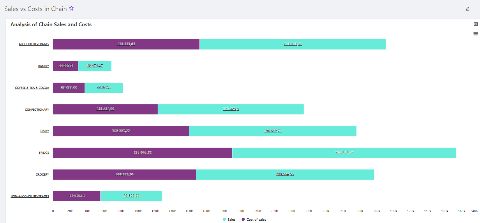
Note! A stacked bar chart is similar to a standard column chart, except that it is capable of displaying a shared comparison.
When should it be used?
- To identify trends and patterns over a while (month, year).
- Comparison of two quantities: supply and demand for products, advertising costs and sales of promotional products, etc.
- It is necessary to compare small parts and the value of the generalizing indicator (section, category).
Recommendations for use:
- The parts of the chart should be in ascending or descending order for better understanding.
- Choose a contrasting color scheme and accentuate with color the places you want to highlight as significant points of change in time.
- The optimal number of parts of the chart is up to 10.
Pie charts
A pie chart is a graph that compares parts of a whole by dividing a circle into proportional parts. The main purpose of the pie chart is to reflect the content and structure of certain metrics (sales value, store stocks of products, losses due to zero stocks, etc.).For example, the distribution of sales value between categories or stores.
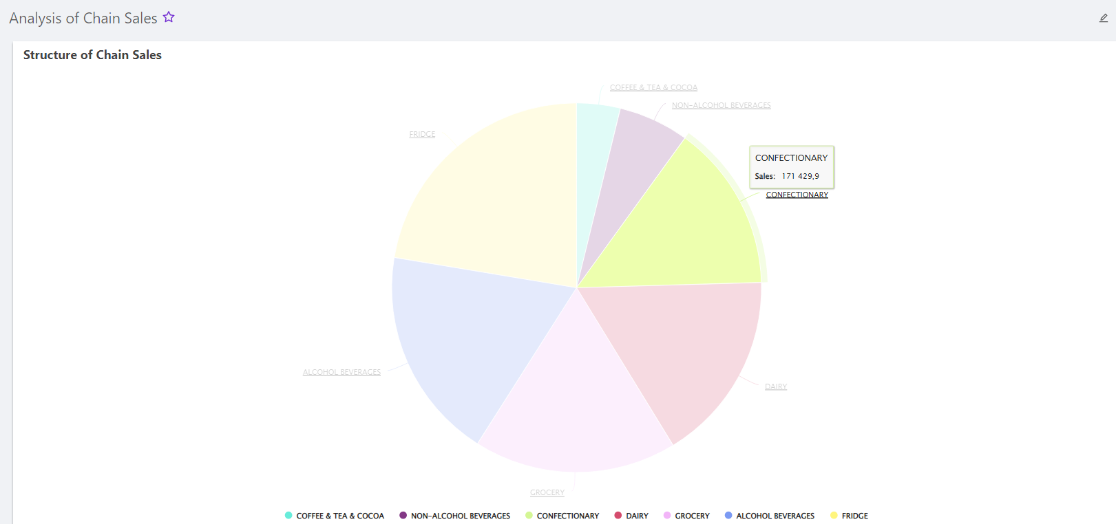
When should it be used?
- It is a necessary set of data - all the constituent elements of the general metric. The sum of all parts of the diagram must be equal to 100% or the value of the summarizing metric.
- It is necessary to study the distribution/structure of metrics/phenomena.
- It is necessary to study the current composition of metrics, not taking into account their changes over time (dynamics).
Recommendations for use:
- Use a limited number of parts for a pie chart. If you have a lot of elements (dimensions), the pie chart will become too complex and incomprehensible. According to expert analysts, the optimal number of pie chart parts is up to 8.
- If you have many small and less important parts, combine them and name this part "Other".
- For a better understanding of the pie chart, sign the parts with an absolute value and their % shares.
Treemap
Treemapdisplays hierarchical (tree-like) data as a set of nested rectangles. The main purpose is to show two different types of information: the meaning of individual data points and their hierarchy.

When should it be used?
- You have large datasets that have a hierarchical structure.
- Ideal for displaying sales data as it shows the percentage contribution of the individual components of the whole. For example, store sales are represented by one large rectangle that consists of smaller rectangles - beverage sales (along with all other categories: groceries, dairy products, bakery products, etc.) and subcategories that go further to alcoholic and non-alcoholic beverages, which allows the category manager to see what is selling well in each category and subcategory.
- If it is necessary to study a large amount of data in detail. For example, a tree diagram with the distribution of product stocks between chain suppliers.
Note! Tree visualizations are a little bit similar in purpose to pie charts, but more complex and informative.
Recommendations for use:
- First, you need to have a built categorical tree for which you need to build this diagram.
- Each box should be labeled with additional information (category/subcategory name, numeric value, and % share).
- Avoid color duplication for a better understanding of the diagram.
Gauge chart
A gauge chart is also known as a "speedometer" chart, reminiscent of the measurement tool of the same name. The main purpose is to assess the progress of the implementation/achievement of a certain indicator.
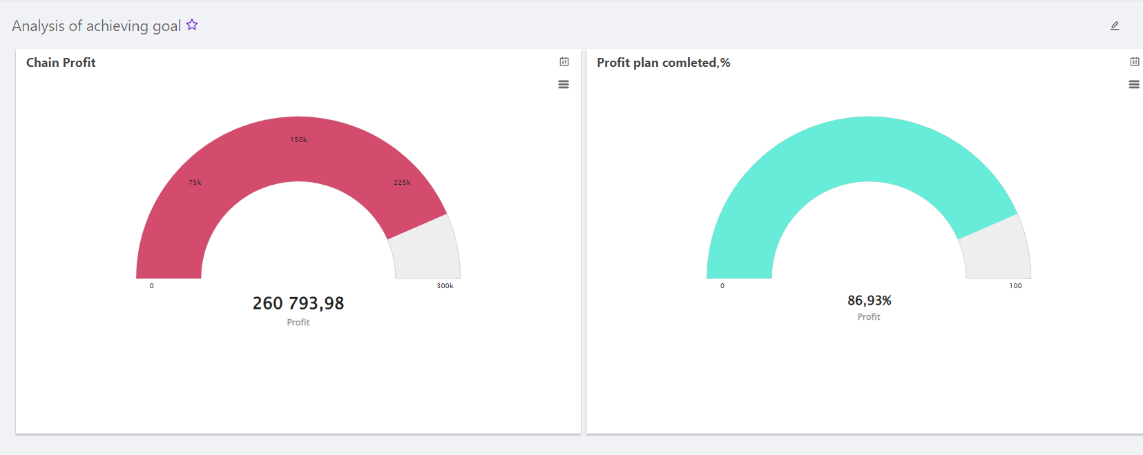
When should it be used?
- You have a linear (simple) range of progressive information and you want to depict how it changes.
- You want to figure out whether goals were achieved.
- For project management in determining the deadlines for the implementation of the set KPI.
- You should conduct a competitive analysis or compare changes in different objects on a common parameter.
Recommendations for use:
- Before creating a chart, make sure you have collected the right data.
- "Speedometer" should be large and ready to display all the information collected.
- If the data is too complex, you can use any other chart.
- Try to make the diagram accurate, understandable, and informative, and make sure it doesn't take up a lot of space.
Conclusion
The Builder (chart builder) contains many tools and techniques for building the best custom visualizations and dashboards. Choosing the best ones can be tricky.
Our biggest desire is to help you navigate the "minefield" and make the most of all the techniques and functionality that will allow you to creatively tell the story of your data.
The visualizations described in the article are not an exhaustive list, to learn more about data diagrams and how they can help you communicate chain analytics visually, contact us - at [email protected].
FAQ - frequently asked questions
What is the basis of any chart?
Any chart visually displays data using graphical elements to represent relationships and patterns. It is based on a set of data, which can be numeric or categorical.
What is a bar chart?
A histogram is a bar graph used to visualize the frequency distribution of numerical data. On the horizontal axis, successive intervals of numerical values of the variable under study are plotted, called classes. The height of the rectangle (column) plotted above each class is proportional to the frequency or relative frequency of the sample values falling within the corresponding interval on the horizontal axis.
What is a pie chart?
A pie chart is one way to graphically represent data in the form of a circle divided into sectors. Each sector represents a share or percentage of the total, and its area is proportional to the size of the category it represents. The entire chart represents 100% or the total amount of data.
What is a tree chart?
A tree chart is a graphical representation of a hierarchical data structure as a set of nested rectangles. Each rectangle represents a certain category or node in the hierarchy, and its area is proportional to the value of this category relative to the total amount of data.


 No credit card required